 |
→ March 2007 Contents → Column
|
Nuts & Bolts
March 2007
|
 |
|
Newspaper photographers tend to shoot in color and publish in black and white. All newspaper pages aren't printed in color, and, if your story is on a black-and-white page, you're printed in black and white.
For the most part, converting the digital color camera image to a black-and-white image for the printed page is no problem. The digital image is displayed in a program like Photoshop, and the color image is converted to gray scale, desaturated or changed to lab color where the channels with color information are removed. Voila, no color - or, as it's known in the trade, black and white. (No, I have no idea why it is not called "black, white and a lot of shades of gray in between.")
Each of these techniques (grayscale, desaturation, lab color) produces a slightly different result. One may produce a more effective and legible black-and-white image than another. Fortunately, all of them are extremely quick to execute. You can do them all, determine which is most effective and still meet deadline.
Unfortunately, there are times when the legibility of the photograph still suffers with any of these quick techniques. Two colors, clearly different in a color image, turn into two similar grays, and, do what you may, the picture is harder to read. The guy in the red shirt standing in front of the blue wall turns into the guy in the gray shirt which, unfortunately, exactly matches the gray wall. He turns into the guy whose head is floating in space.
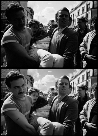
The only difference between these color conversions to black and white of the "Troubles" in Ireland is
that one emphasizes the blue in the image and the other, red.
You can quickly preview the results of a picture containing only the red, green or blue component and see which produces the most legible image. These effects will be extreme, often looking unnatural. You will want to produce the final image with a blend of colors.
Back to the guy in the red shirt. When we look at the black-and-white image produced by the red channel, we see a light shirt that stands out against a dark wall. His face is also ghostly pale. By creating a final black-and-white image that is, say, 70 percent red, 20 percent green and 10 percent blue, we have both a natural looking image and one in which the subject doesn't fade into the background.
You may have noticed that digital images converted to black and white sometimes have a disturbingly "flat" look compared to film images printed on silver paper. Paper-printed film tends to have a lower contrast in the darker values and, sometimes, a lower contrast in the highest values. Or, to think of it in another way, silver has higher midtone separation. This slightly higher contrast in the important middle values can add "punch" to the image without blowing out shadow or highlight detail.
And you can duplicate this in a black-and-white digital image by playing with the curves in Photoshop. Make that curve slightly S-shaped with the middle three-fifths or two-thirds at a steeper or contrastier angle than the shadow and highlight portions. Quite often this can add a touch of legibility to the final image on the printed page.
I have to confess, I really don't convert to grayscale, desaturate or deal with lab color when I convert a color digital image to black and white. I go directly to Channel Mixer. I've done this so often that it adds very little time to the image processing. For most images I hold the blue channel at relatively low levels because it seems to be the noisiest channel. Whenever I want to smooth out the complexion of a young lady or make sure that those clouds show up in the sky, the red channel is a little higher than it would be if I wanted to mimic film. But, for the most part, I just play with the channels to minimize tonal mergers and make the image as clear and legible as possible. The chosen r, g and b values vary from picture to picture.
While the newest Photoshop, CS3, allows you to quickly mimic the effects of popular colored filters in black-and-white photography, Channel Mixer remains as a more controlled method of increasing the legibility of black-and-white conversions.
Digital photographers who choose to work primarily in black and white and fully exploit the esthetic effects of controlling the conversion from a color image may want to look at a Photoshop plug in called Convert To B&W Pro v3.0 from the Imaging Factory (http://www.theimagingfactory.com/). In addition to converting color images to black and white, it can mimic the effect of colored filters of almost any color and strength and mimic a variety of black-and-white emulsions. It also adds controls for us older folks that mimic film exposure, enlarger exposure and paper grade. It is not cheap ($99.95). And it's not a simple, uncomplicated program to be used on fast-breaking news. But, for the dedicated black-and-white photographer in the "all color, all the time" world of digital photography, it gets you back to basics with a little more class than just desaturating all your work.
© Bill Pierce
Contributing Writer
|
|
Back to March 2007 Contents
|
|