About once a week someone says to me, "If Gene Smith was around, he would be the master of Photoshop." It's true. W. Eugene Smith didn't think the making of a photograph stopped right after you pushed the shutter button. The print was important to him.
Often, as photojournalists, we don't have the control over the subject that, say, a commercial photographer in a studio might have. Try as we might, our images of relatively important events can often be hodgepodges of illegibility. Much of Gene's printing skills went into making those images legible and understandable, simple and direct.
You can argue that this very simple esthetic is a bit pictorial and that exploring the mystery of an image deepens the viewer's involvement. But that's for pictures on museum walls, not the pages of news publications. Gene's pictures are on museum wall now, but they started their lives on the pages of news publications.
His basic technique was very simple – emphasize the important and de-emphasize the less important, but do not eliminate it.
The following description of his printing technique is a gross oversimplification. It's sort of like saying a great concert pianist hits the keys with his fingers. But it will give you an idea of what he did.
With silver printing, he depended on variable contrast papers. By slightly burning down the less important elements in the picture through a low-contrast filter, slightly darkening them and eliminating the sparkle in the specular highlights, he made them less compelling than other elements in the picture. This is something that you probably would not even notice if you did not have before and after prints to compare. Nothing is eliminated or obscured, just damped down a touch.
The more important elements in the picture, not given this treatment, now stand out a bit. By giving a slight wash of potassium ferracyanide bleach to the most important areas, those areas are slightly lightened, their specular highlights sparkle – and they stand out even more from the rest of the picture.
How do you accomplish this digitally in Photoshop? Piece of cake... Lasso the main subject with a highly feathered lasso. Invert the selection so that what you do next affects everything but the important main subject. In curves, drag the top of the curve down just a touch so that nothing in the selected area has a pure white. In levels, move the central, mid-tone slider so that these areas are ever so slightly darkened.
Invert that lasso and use the highlight slider in levels to slightly lighten the main subject and make its specular highlights sparkle.
Oversimplification? Of course. But it will get you started. Remember, the point is to make the wallpaper a little less obtrusive and the important person a little more compelling. Do not overdo. Keep it simple and minimal.
In the old silver days, there was a period of around two years when overburning the background produced a lot of contest winners in the feature pictorial category of news picture contests. "And God so loved the little puppy in the basket that he sent a shaft of light from the darkened heavens onto the puppy in the basket." Because, unlike the effect of the lasso tool in Photoshop, you could literally see the silhouette of the silver printer's knuckles in the burn, the technique became known as the Hand of God and so ridiculed, it disappeared from the contest world. In other words, once again, do not overdo; keep it simple and minimal. This is a technique to increase the legibility of complicated images, not to win prizes by creating "arty" images.
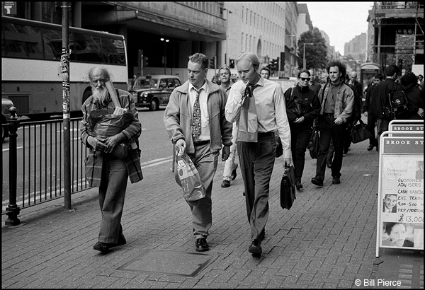
As to this month's "picture that has nothing to do with the column," I am fond of this picture because my friend Arthur Grace once told me that catching that brief moment where the two, somewhat dissimilar, gentlemen exchange glances clearly demonstrated my superior reflexes. I have not pointed out to him that I do not print or show the many, many more frames in which I clearly missed the moment.
