In and around the Seventies, the news magazines began to increase the number of color pages – as much to service advertisers that wanted color ads as to bring color photojournalism to their readers. Over the following years, newspapers would also begin to print much more color.
And one newsmagazine would even bill itself as the "colorful newsweekly." That always struck me as one dangerous step away from the "perky newsweekly."
News photographers can't and shouldn't control the color in a news image. But color has a strong effect on the viewer's response.
I remember being in the office of a photo researcher when pictures of a presidential funeral came in. The researcher was upset with some of the pictures and asked me what was wrong; why was this group of pictures no good? The pictures were taken outdoors on a beautiful, sunny day with a bright blue sky and fluffy clouds. If you looked at the color and not the content, the pictures were not somber or sad. If you looked at the content, the pictures were somber and sad. In other words, the pictures were complicated. When only one wallet-sized image was going to accompany the article on the magazine page perhaps a simpler image was appropriate.
One day a friend of mine turned in an environmental portrait of a subject in his workspace. The photo editor asked if he couldn't have photographed the subject against a wall with a nicer color. Not unless the subject repaints his workspace or the editor changes the assignment.
Imagine Gene Smith's famous shot of her mother bathing Tomoko Uemura, the physically deformed and mentally damaged victim of mercury poisoning, that is perhaps the most memorable image of Gene's Minamata essay – imagine it in color.
Perhaps it would not be lessened if the image was in warm and muted colors, but we have no idea what the actual predominant colors of the scene were. Perhaps a bilious green with cyan overtones.
I have seen a concocted color version of Joe Rosenthal's Iwo Jima flag-raising photo. Perhaps a bit overdone, it turned it into just another poster. Perhaps an eye-catching album cover, but not a tribute to the price of victory.
Color is powerful stuff. A small percentage of news photographs are actually improved by it. A small percent are ruined by it. Neither outcome has much to do with the photographer.
For the most part, when you are dealing with content-driven news material, color lifts the lowest and most banal and drags down the best and most exceptional. The bright red countertop in the picture of the local bake sale is attention getting even if the cupcakes aren't. The blue apron in a sea of neutrals takes attention away from what is really happening in the photograph of the neurosurgeon at work.
All in all, you get a huge mid-ground of homogenized images. This blend of bad made better and better made worse is totally different from the work of photographers who can control the color by choosing the time of day or by staying with the subject over an extended period of time, who can exercise controls in taking or post-production that are not appropriate for news photographers.
That's right, color can get in the way of NEWS photography. You have to ask yourself, "Is the color appropriate?" The local beauty queen in the sodium vapor lit arena? Probably not. The local rock group under heavily gelled spotlights? Probably yes.
The nice thing about digital is that rendering an image in black-and-white is easy, quick and produces higher quality results than yesterday's black-and-white conversion negatives from color slides.
A few pointers ...
Any number of digital image programs allow you to "filter" the image, mimicking the effect of colored filters on black-and-white film. Orange and red filters bring out clouds; green filters lighten foliage, etc. But, what is most useful to news photographers is using filters to prevent tonal merger. You convert to black-and-white and suddenly the subject's shirt is the same gray as the background. Toss in the effect of a colored filter and the two similar values may separate and the picture become more legible. Just run through the filter selections in your image processing program and see if one of them improves the picture's legibility.
In Photoshop you can change the grayscale rendition of color pictures strongly and quickly with Channel Mixer (Image/Adjustments/Channel Mixer). By quickly seeing what each primary color channel does to the image, you can come up with a blend that enhances grayscale separation and legibility.
Images on black-and-white film printed on conventional enlarging paper tend to compress the shadow values (highlights to a lesser extent) and expand the mid-tone values of a print. There are a number of ways to accomplish this digitally. You should experiment and see if you think this improves your black-and-white images.
The most basic way to do this is with "curves" in your digital image processing program. If the curve that you first see is a straight line, alter it until it is slightly "S" shaped. If it's already "S" shaped, make the S curve a little stronger. And make the curve on the bottom of the "S" stronger than the curve on the top.
If you are using the current version of Photoshop or Lightroom, you can just go to Tone Curve/Point and look at the effect of the Strong Contrast setting on your image.
While this column may seem a strong argument not to forget the possibilities and power of black-and-white (and it is), it would be unfair not to share knowledge gained from experience about the positive power of color in two important areas of documentary photography. Always photograph grandchildren and household pets in color.
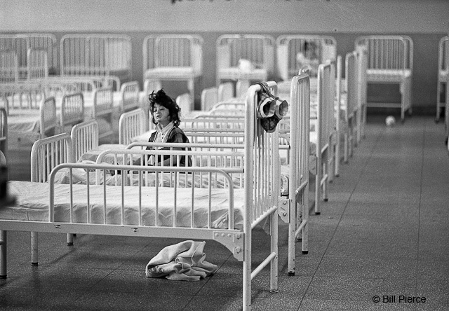
As to "the picture that has nothing to do with the column," since it's in black-and-white, I suppose it has a little to do with the column. It's from a story on Willowbrook, a mental institution, some of whose doctors allowed a Time magazine writer and photographer into the facility to document conditions they felt were inappropriate but unavoidable because of limited funds. Obviously, they felt a story might change the situation. The pictures were made with one camera and lens kept under my jacket, and a small flash kept in my pocket, when others were around. More of the Willowbrook pictures are at http://www.billpiercepictures.com.